The difference between a good webdev and a great one is that the great one can not just make sites, but also reason about ways to get more sales.
I will mainly be focussing on hosting and IT websites because that is my area of expertise, but you will see these things everywhere. I plan on writing another article on business models, writing, and maybe talks. But i’ll see how far i can get.
Example: DigitalOcean

Digitalocean is one of those sites that every web developer should have looked at.
I’ll point out a few things that they do right, in no particular order:
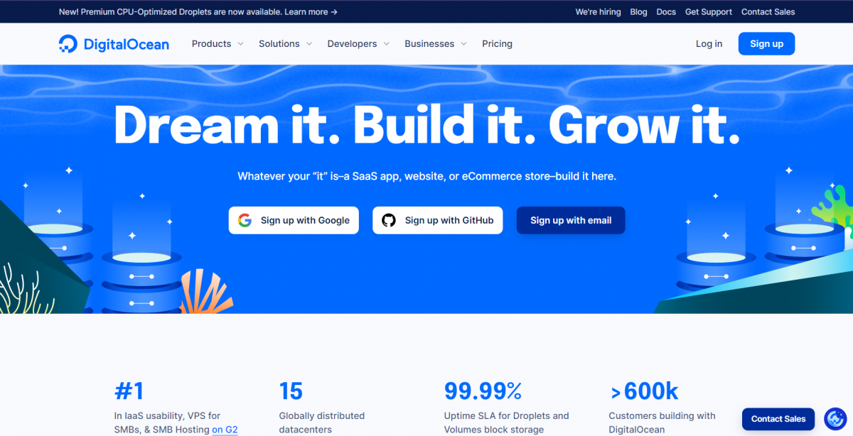
- Colors and design stick out. The blue sticks out, and together with the modern design makes for a pleasant page to look at.
- The subtitle instantly shows some examples of their most common customers, and is kept very generic. People who want to host an application that fits one of these categories is immediately ensured that they’ve come to the right place.
- One-click sign-on with the two platforms that are most commonly used (and ofcourse a normal email signup). The barrier of entry is very low.
- Sales button on the bottom right for questions, and bigger businesses that may need more convincing but bring in more value.
- The numbers at the bottom of the page show that this is no small company and can probably be trusted.
Some other things done well on the DO website from a business perspective:
- Case study – While i would argue that these are not very useful for most people, they absolutely help in convincing other people that a similar business is already using them and thus it should be good.
- Free credits. The cloud hosting market is competitive but with limited-time free credits people can start deploying their app without any risk, and will likely stay if it just works.
- Digitalocean has a very large knowledgebase of non-do related help articles for almost anything related to system administration. This helps both their marketing with increased brand awareness and gives an enormous boost to their SEO.
Website: https://www.digitalocean.com
Salesforce
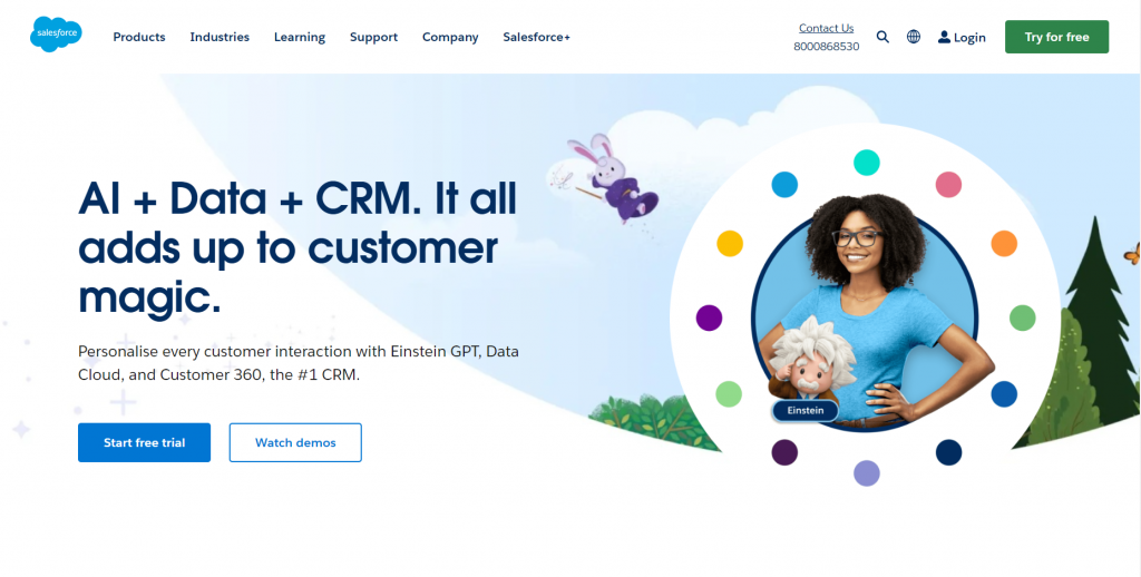
Salesforce is a b2b CRM company. While i do not enjoy their design so much, they got a lot right in regards to selling.
- 2 big buzzwords and their product type, right as the first thing you see. This site is obviously more targetted towards business decision makes and will immediately get them interested.
- They offer a free trial, and a demo video so you can get in without any excuses.
- The header also contains a “industries” button where they lay out how different industries use their product. This gives them a sense of having experience and shows examples of how your company can be improved by their product.
- Also; a plain old phone number. Pick up the phone and you’re right there talking to their sales team. They also offer a livechat, but it’s a bit more hidden for some reason.
Site: https://www.salesforce.com/
Tesla
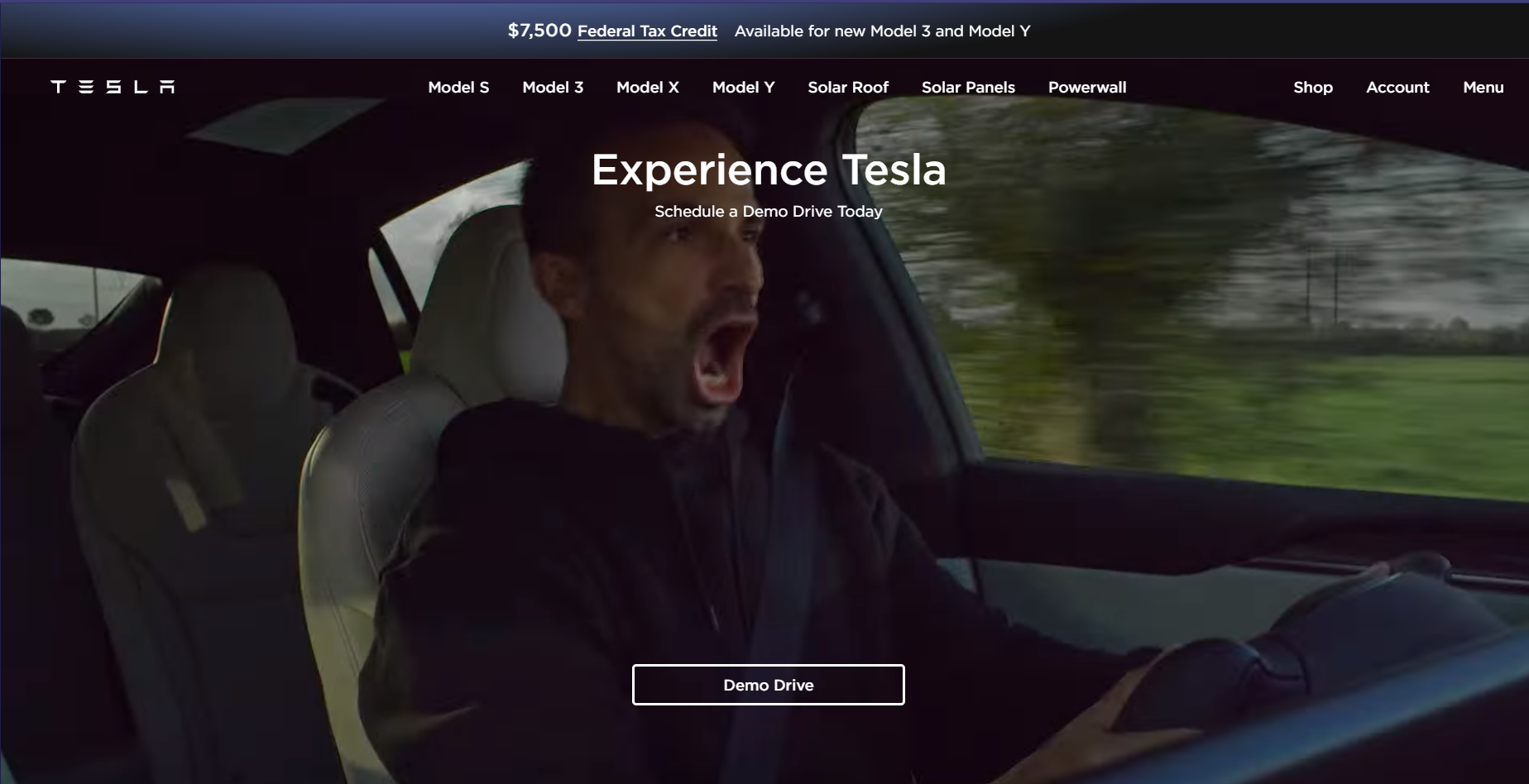
While the salesforce site was relatively plain, the tesla website again sticks out. You are instantly dropped into a video of a tesla car driving through harsh conditions and a man enjoying the speed – probably recognizable for their target audience.
They put a lot of attention into getting a demo drive. I presume because their cars are mostly sold from their website so that the usual demo drive at the dealer is less of a thing.
One thing that sticks out is the big 7500$ tax credit banner. People *love* free money and this makes it feel like it is both time-bound and a very good deal, even though teslas are quite expensive.
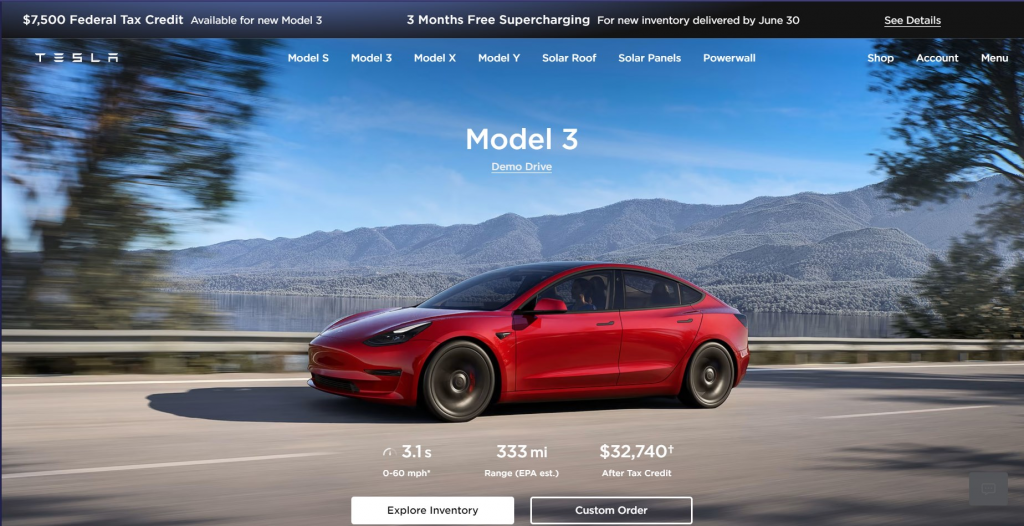
The product page is also something different. You instantly see the car in a nice view, the most important stats and the option to choose a predetermined model or custom order (on a consumer car?! what?!)
Some of the most common concerns are also instantly addressed on the product page. An image shows the safety structure of the car (americans…), the thousands of charging stations and a visualization of the range
The tesla site is surely a source of inspiration: https://www.tesla.com
FS.com
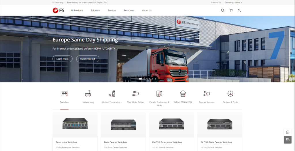
FS sells network supplies to businesses, and you can instantly recognize a few points
- Europe Same Day Shipping. This is often an issue in the b2b space. And takes away an important doubt.
- I’m visiting from Europe, so i get European page. FS is mostly chinese, but seeming local really helps.
- All products prominently visible
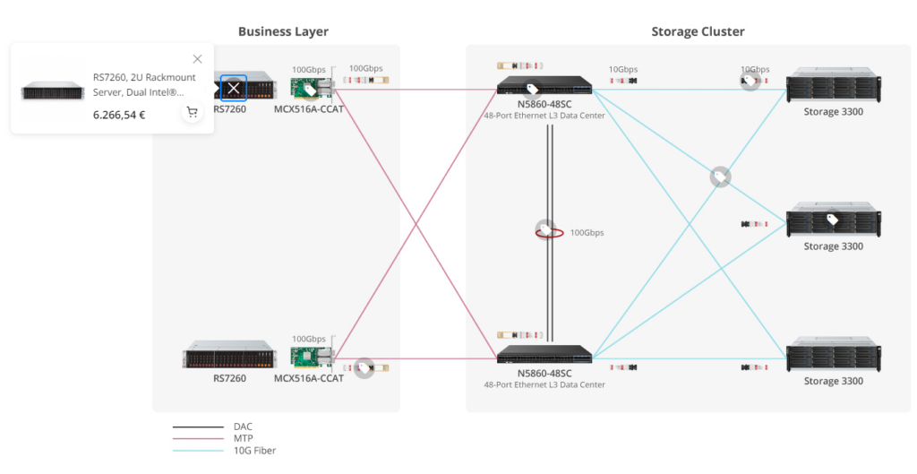
Showcases like this is why i wanted to show this example. Showing an example layout talking about possible setups is an *Amazing* way to get more people to buy more product. Not everyone is an expert, and having a setup that is almost copypastable is great.
Godaddy
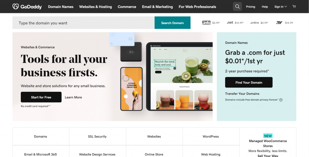
Alright, let’s try it for yourself. What design and business choices can you pick out from this website?
Others
There are many good other examples of well-executed websites, but showing more would mean a lot of repetition of the previous examples. Do you have site that you really like or has some novel ideas? let me know and i might add it to the article.
Have a good day!
– Luc
